THE SHIFT Stories from Car Culture
THE ORANGE DISRUPTION
From Warning to Weapon
An Exploration of Automotive Luminescence
By Andy Parker
Art Editor, THE SHIFT
The Tyranny of Rosso
There are colors that ask for your attention. And then there are colors that demand your compliance.
For a century, automotive performance has been held hostage by a single hue: red.
Rosso Corsa became the default language of speed, a visual shortcut for blood, danger, and Maranello.
But red has become an institution; it has become corporate. Orange, however, remains an anarchist. It is the color of the warning light, the molten steel, the threshold where safety ends and physics begins.
The McLaren Genesis
To understand the soul of orange, you must look to the rain of 1968.
Bruce McLaren didn't choose Papaya Orange because it was beautiful; he chose it because it was visible.
In the low-contrast world of early television and mist-shrouded tracks, the luminous hue ensured his Can-Am and Formula 1 cars could not be ignored.
It became an accidental heritage.
Today, when the McLaren P1 pulls on the deep, liquid depth of Volcano Orange, or the 765LT shrinks itself into McLaren Orange, it isn't just wearing paint. It is wearing a historical refusal to blend into the scenery.
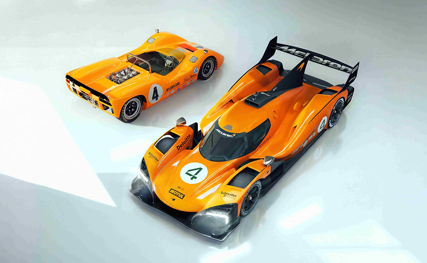
McLarens of different eras
Sant’Agata’s Visual Violence
If McLaren used orange for tactical survival, Lamborghini used it for visual warfare.
Orange is woven into the very fabric of the V12 flagship legacy.
When the Aventador LP700-4 launched in Arancio Argos, it didn't look like a car; it looked like a shard of volcanic glass.
From the metallic fury of Arancio Atlas on the Gallardo to the complex, light-shifting Arancio Xanto on the track-honed Huracán STO, Sant’Agata understands that orange is the ultimate canvas for sharp, geometric violence.
It is a color that refuses to apologize for its own volume.

Aventador LP700-4
Dino’s Rebellion and Rare Heresy
Ferrari is a religion built on red, which makes their brief dalliances with orange feel like brilliant heresy.
Enter Arancio Dino.
Named in honor of Enzo Ferrari’s late son, this non-metallic, searing orange stripped away the clinical prestige of the racing team on the 1960s Dino 246 GT and replaced it with something deeply emotional and rare.
Even today, seeing a modern SF90 Spider or a 488 GTB specify an orange metallic hue from the Tailor Made department is a shock to the system. It is a calculated middle finger to tradition.

Ferrari Dino
The Pop-Culture Ignition
In 2001, cinema changed the visual landscape of car culture with a single machine: a 1993 Toyota Supra painted in Lamborghini’s Arancio Atlas.
The Fast and the Furious didn't just launch a billion-dollar franchise; it introduced a generation to the concept of the "Hero Car."
The bright, pearlescent orange Supra became an overnight cultural icon. It wasn't subtle, and it wasn't aristocratic.
It was the visual manifestation of nitrous oxide and street-level defiance, a statement that speed belonged to the loud, not just the wealthy.

Fast'n'Furious' Supra
The High-Performance Counter-Culture
Outside Europe, the domestic muscle and supercar elite used orange to signal a different kind of threat.
Chevrolet’s Corvette ZR1 coated itself in Sebring Orange to announce its supercharged intentions, while Dodge laid down Header Orange and the historic Go Mango on their Hellcat and Redeye monsters.
It is the color of blue-collar noise taken to an extreme, a visual warning that the machine sitting at the stoplight is barely contained.

Chevrolet’s Corvette ZR1
The Exclusivity of the Hyper-Spectrum
At the absolute peak of the market, orange becomes the marker of the hyper-elite.
Think of Koenigsegg utilizing signature orange paint schemes on the CCR and the Jesko to frame their record-breaking engineering.
Think of Bugatti dressing the Chiron Super SS in striking orange-and-black configurations, or the Ford GT Carbon Series cutting through the carbon fiber with Epic Orange accents.
Even the boutique Spyker C8 Aileron leaned heavily on a uniquely styled orange exterior to match its aviation-inspired cabin. At this level, orange is no longer just a color; it is a declaration of absolute engineering dominance.

Spyker C8
The Korean Renaissance
For decades, executive luxury was defined by muted greys and aristocratic blues.
Then Genesis unleashed the Magma program.
With their new hypercar and performance concepts bathed in a deep, molten, metallic orange, the Korean brand did something radical.
They used the color as a declaration of war against the European establishment.
The Magma hue represents energy, heat, and high-tech velocity.
It’s an admission that to establish a new empire, you cannot copy the old gods. You have to set the stage on fire.

Genesis
Red belongs to tradition.
Orange belongs to those willing to challenge it.
The Cover Star: Arancio Zero
And now, we arrive at the catalyst for this issue's visual direction.
The legendary house of Bertone has resurfaced with a shade that redefines the corporate palette: Arancio Zero.
This isn't a color cooked up in a marketing meeting to satisfy a trend.
It is a portal to the golden age of automotive futurism.
The color of Bertone, Arancio Zero is a hyper-saturated, brilliant orange that served as the personal calling card of Nuccio Bertone himself.
It is the signature of a house that refused to let car design stay anchored to the past.
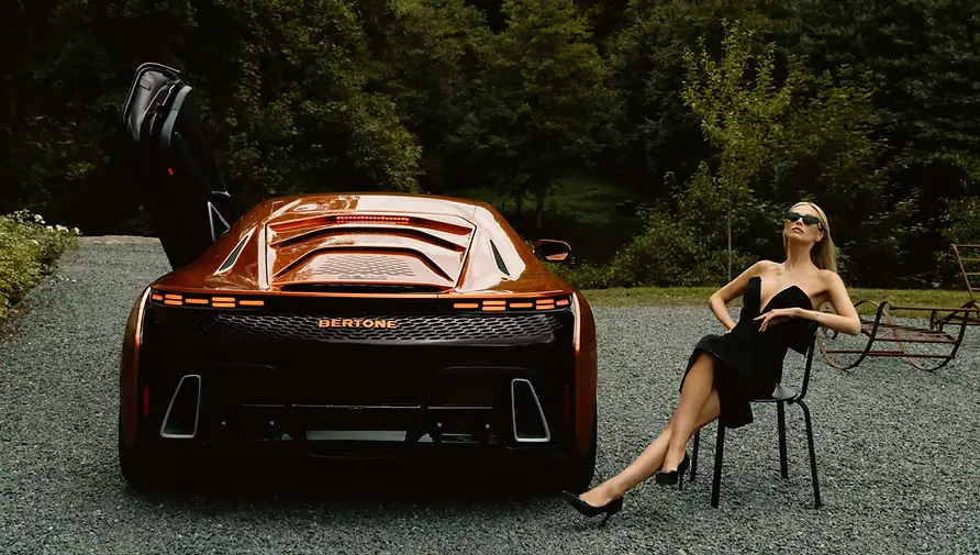
Bertone GB110
Architecture of the Mind
To understand the power of this shade, you have to look up.
Nuccio Bertone was so consumed by the energy of this specific orange that he used it to paint the ceilings of the Centro Stile in Caprie.
Walking into that design studio in the 1970s was a psychological shock.
Beneath a canopy of vibrant, glowing orange, legendary shapes like the Stratos Zero and the Countach came alive.
The color didn't just sit on the cars; it hung over the designers like an atmospheric battery, fueling the space-age geometry that shattered old-world styling conventions.
Lancia Stratos Zero

The Secondary Shock: Adamastor’s Fury
While Bertone anchors our cover, the orange rebellion continues inside the magazine with Portugal’s first true supercar: the Adamastor Furia.
Priced at €1.6 million and limited to just 60 units, this carbon-fiber monster forces its way into the conversation.
Beneath its sculpted, track-bred skin lies a +750 horsepower twin-turbo V6 sourced from the Ford GT.
But it is the choice of its launching skin, a searing, raw, uncompromising orange, that demands our attention.
It is the color of a new dawn for Portuguese manufacturing, standing shoulder-to-shoulder with the design giants.

Adamastor Furia
The Venturi Vortex
The Furia’s design wasn't penned by an artist dreaming of static lines; it was sculpted by an aerodynamics team given total creative freedom.
The car is built around massive, exposed underbody Venturi tunnels that generate over 1,000 kg of downforce.
When painted in this electric orange, the bodywork acts like a fluid. The color highlights the extreme, aggressive packaging, the Formula 1-style nose, the tightly wrapped central canopy, and the brutal rear diffuser.
The orange doesn’t just cover the carbon fiber; it illustrates exactly how the air travels over it.

Adamastor Furia
The Spirit of Dakar
There is a rugged, lawless energy to the Furia’s orange that connects it directly to the spirit of the original Paris-Dakar Rally. Orange has always been the color of survival in the desert, the high-visibility contrast against the endless sand.
By wrapping a hyper-sophisticated, track-focused weapon in this unforgiving hue, Adamastor bridges the gap between the clinical perfection of the wind tunnel and the brutal, "run-what-you-brung" romance of endurance racing. It looks ready for a Le Mans grid, but it feels born from the wild.

Dakar Rally
Chronographs and Cinema:
When Hollywood Met Racing
The orange thread extends far past the bodywork of the cars themselves, bleeding directly onto the wrists of the drivers who define our culture.
Also featuring on this edition, Paul Newman: When Hollywood Met Racing, we track the intersection of cinema, speed, and time.
When Nivada Grenchen set out to design a new model of their iconic Chronoking watch in homage to the legendary actor and driver, they didn't reach for traditional monochrome.
Against a stealthy, all-black body, they chose a single, razor-sharp highlight color to punctuate the dials: Orange. It is a testament to the color’s status as the ultimate tool of legibility, precision, and cool under pressure.

Nivada Grenchen Chronoking
The Absolute Shift
In the final analysis, red will always be the history of the supercar, but orange is its pulse.
From Bruce McLaren's tactical visibility to the internet-breaking Supra; from the high-tech heat of Genesis Magma to the architectural monument of Bertone's Arancio Zero, the aerodynamic lines of the Adamastor Furia, and the dial of a Nivada Grenchen Chronoking.
It is the color of transition.
The color of the redline being crossed.
As you turn the pages of this issue, remember that the stories we celebrate most are the ones written in the brightest ink.

McLaren F1 GTR

